The Brand
This was a really fun one.
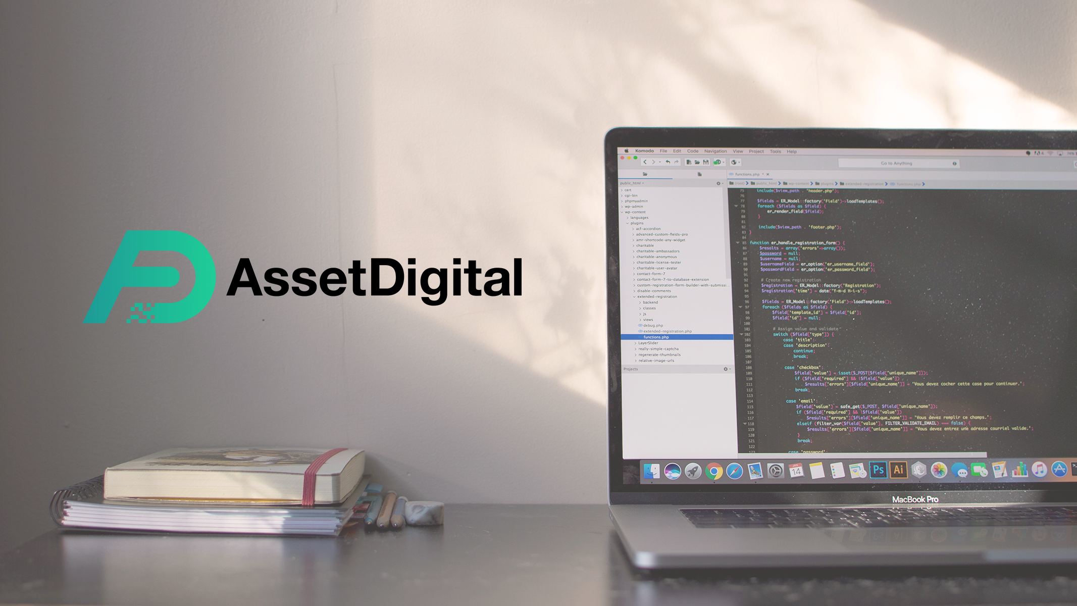
For this project, I worked with Sam Absalom over at AssetDigital to develop a fresh new logo for their brand.
AssetDigital is a domain name consultancy with a corporate focus.
Sam already had a pretty good idea of what he wanted in a logo, so that helped the design process move fairly quickly.
Concepts
When Sam and I had our first Discovery session, he laid out some specifics he wanted to see in his logo:
- Clean, black text. Preferably Helvetica Bold or similar.
- Logomark using the initials "AD" with the AssetDigital text beside it.
- Logomark designed for presentation in color and one-color (which is pretty standard anyway).
Sam also mentioned that he really liked the style of the Polygon and Uniregistry logos, so I used those as inspiration.
Additionally, Sam expressed that he liked the look of a pixel gradient / "digital fade" and wanted to see it incorporated into at least some of the concepts for the AssetDigital Logo.
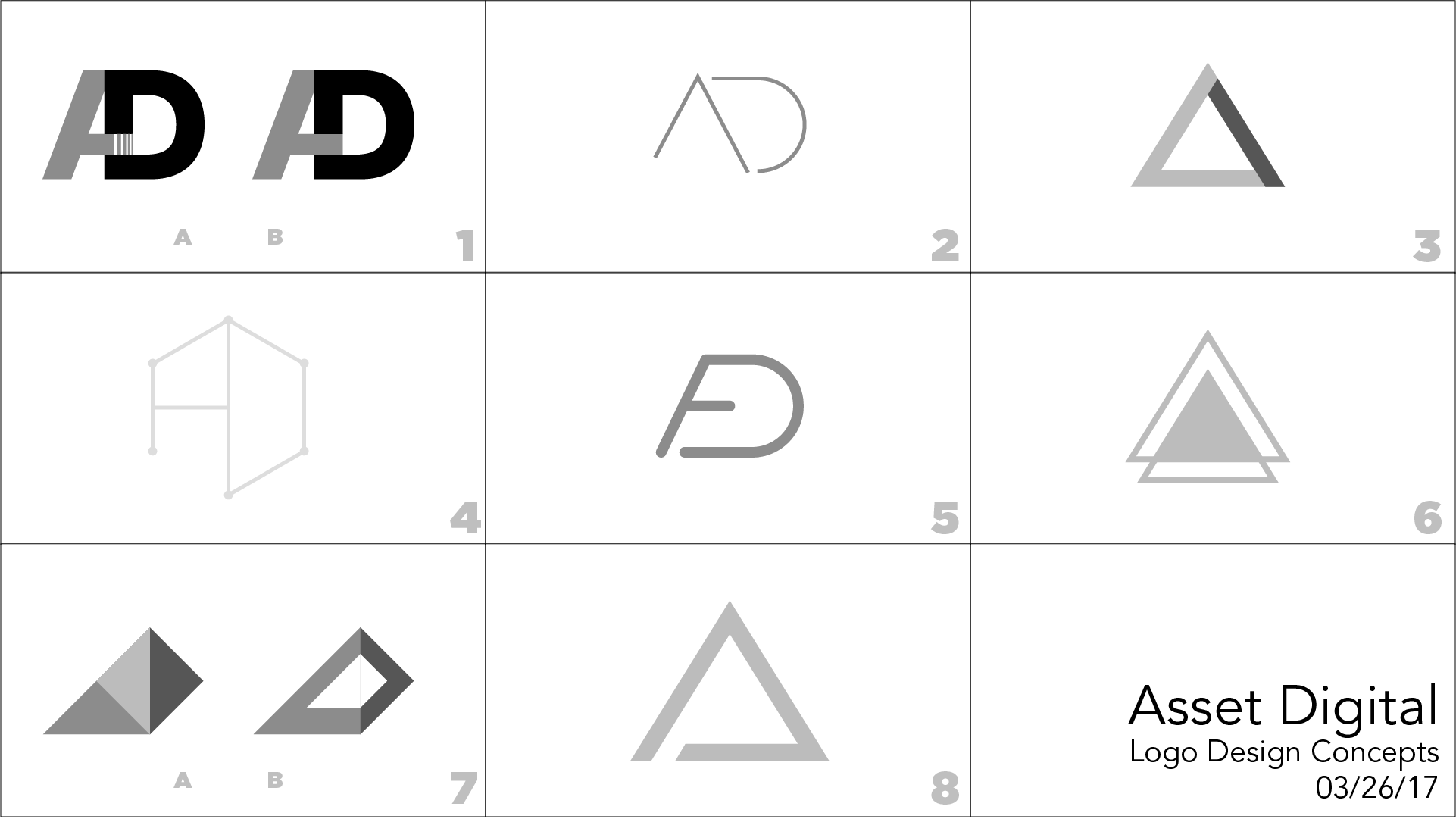
The design process for this was trickier than I initially expected. Geometric logos are super popular, especially ones with a simple triangle mark, which meant that I had to be careful not to wind up making a derivative logo. I also opted to stick to black and white logos at first here, since I've started to find that adding colors during the conceptualization process can affect the design process negatively, since it draws your attention (and more importantly the client's) away from the design itself and more to the color. I've had a few clients give feedback on the concepts asking to see designs in different colors, which is fine - but doesn't do either of us a lot of good since ultimately this phase is just about picking a design.
First round of concepts
For this first round of concepts, I really ony liked #3 and #7. #1 seemed to work well for the brand, but reminded me of something you would see as a logo for a long-haul trucking company. #7 was loosely based around the shape of the "AD" mark (half triangle for A pushed up against half triangle for D), but I was worried it was too similar to Polygon. #2, 4, & 5 I thought had potential, but would have to be significantly reworked if we were going to move forward with them.
I sent the concepts off the Sam and we moved into the next phase of conceptualizing. We decided to move away from the triangle logo and stick more closely with the "AD" marks. Sam really liked #5, but I needed to make it look less like a cartoon tongue (my words, not his). He also wanted to see more of the pixel gradient incorporated into the concepts, which leads us to Round 2:
Pixel Gradient on the Classic AD Mark, thickened up the lines on the "tongue," tweaked the not-Polygon logo a bit more, and tried a simple pixel gradient just on the AD to get a feel for it. Sam chose #2 and wanted to see it with some gradient options. We also locked down the text formatting at this stage, opting to forgo the Small Caps in favor of traditional text. I also made the mistake of including a space in between "Asset" and "Digital" like some kinda jabroni, so I took those out at this stage too.
Sam chose Door Number 3 in this Showcase Showdown, so it was time to add some color and start making this logo even prettier.
Typeface
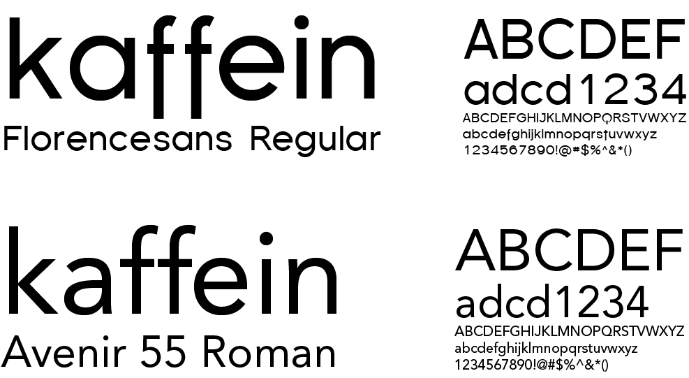
Typeface on this project was really simple. Sam already knew he wanted to stick with Helvetica Bold in black - to match the corporate look that he liked. Saved time on this step, but also meant that the design would have to be designed around the font, not the other way around. Fortunately, Helvetica is very clean and simple, so I didn't run into any issues like I may have if Sam decided he really liked the look of Viner Hand ITC.
In case you forgot what Helvetica looks like.
Colors
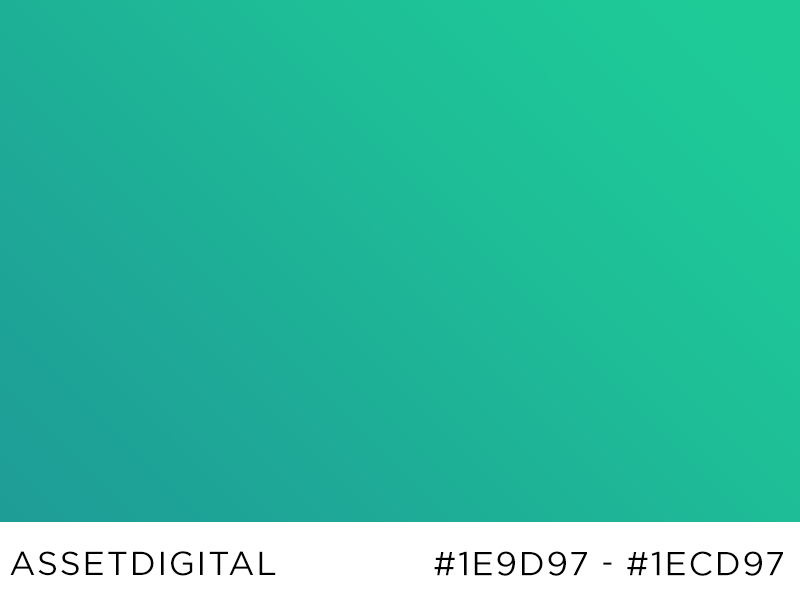
Colors! This is the fun part. Sam really liked the blue that I use in my own logo, so I found him a couple bright blue options (#1 & 3). He also specified he wanted to see a version in a mint green (and was nice enough to provide the exact color he wanted to see: #1ecd97).
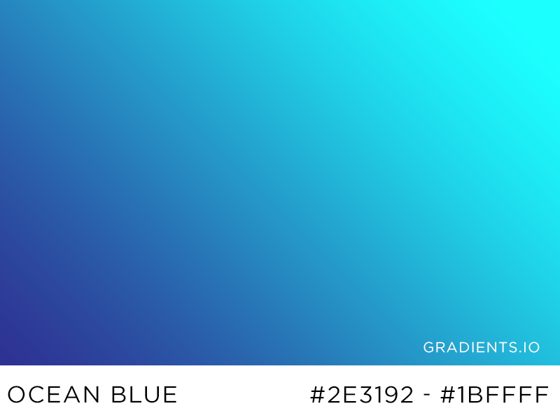
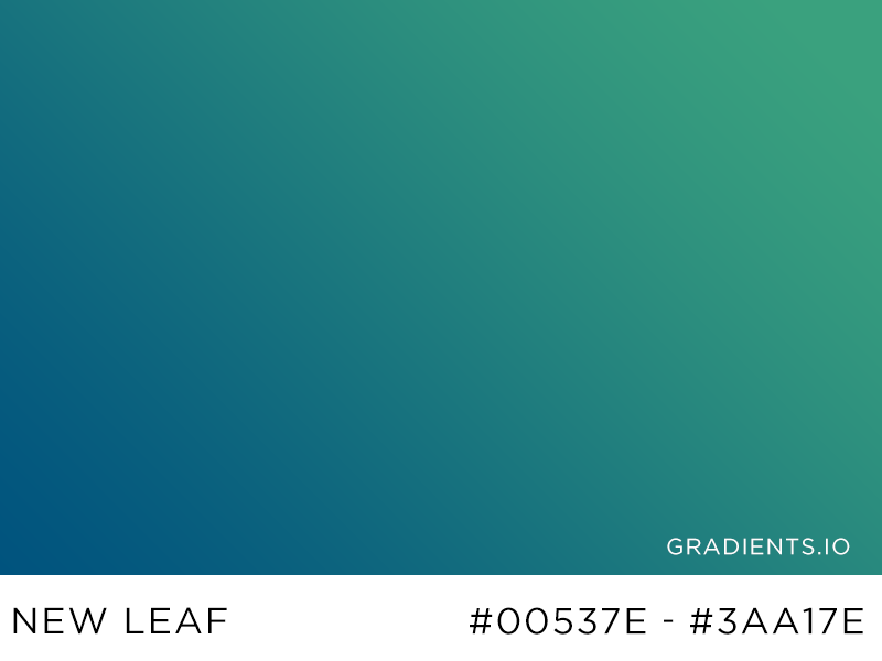
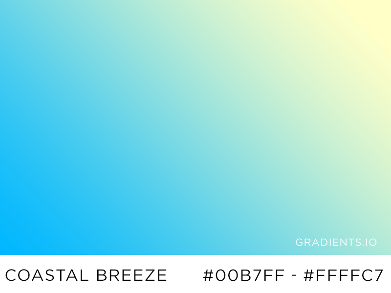
For the gradients, I hopped over to visit my new favorite color resource (shout out to coolors.co anyway though): gradients.io, a curated collection of beautiful gradients from designer Luke Davies. I chose three gradients that I really liked, and then eventually made one of my own, based off the "New Leaf" gradient, but using Sam's mint green instead of the darker blue-green in the original:
Sam really liked the minty green gradient, so I moved onto the final lockup.
Lockup
All the cool kids on Dribbble will tell you that you need to make a cool lockup showing your design process and ratios, or else they'll beat you up and take your lunch money.
Design elements.
The more astute observer will notice that this lockup looks like it was made by a kindergartner. I am aware. In the words of Frank Reynolds:
Final Thoughts
So what did we learn from this?
- No color is better for initial logo concepts, because it forces you and the client to focus on the actual design.
- Helvetica is really easy to work with.
- People on Dribbble make fun of you if your logo lockup looks bad.
Cool stuff below. ∎
Validate my existence:
Brand Image 01
Brand Image 02
