The Brand
In this case study, I'm going to walk step-by-step through the creative process behind the development of the new logo and brand identity for Kaffein.
Kaffein is a software development company [that is] primarily focused on mobile and custom Integrations.
I was approached by Amir from Kaffein about designing a logo for his brand in a similar vein to the logo I designed for East Rising Media back in December. He liked the "simple but elegant" style and wanted to see if we could leverage a similar look for Kaffein's brand identity.
When Amir first contacted me, he knew he wanted a logo that drew inspiration from 2 things: the letter K - which makes his brand name distinct - and coffee, the lifeblood that fuels the dreams of champions.
This is the logo that Amir was using at the time he contacted me:
The previous logo for Kaffein
It looks nice, but there's a lot to be improved. Most notably, it looks too much like a logo for a coffee shop. It captures the essence of "Caffeine" the substance, but not of "Kaffein" the software company.
The Concepts
I played a lot with Amir's ideas, trying to find simple and clean icons that use the coffee mug or simple software-related glyphs to create the look of the K that I liked. As you can see from these sketches, some ideas were good, and plenty were far from (most notably the abominations on the right that look like if the lamp from Aladdin were mixed with some sort of alligator).
But that's the point of the conceptualization process - to separate the good from the bad and find the ideas that are truly worth developing.
After deliberation, I chose the following 7 concepts to clean up and send to Amir. At this point, my personal favorite was #6. It had the cool hipster icon look, and I thought it would look sweet on a hat. #1 and #2 (along with #6) were my attempts at more abstract versions of the "K" symbol - capturing the "essense" of the letter moreso than the letter itself. This was a concept I really liked, but the feedback I got on these from some designer friends taught me a pretty important lesson here: No matter how cool you think your design looks, if people can't tell what it's supposed to be, the design has failed its purpose.
You'll notice that at this point I also included some possible font pairings - but I'll get to those in a minute.
Amir and his team decided that they liked Designs 6 & 7 the best.
At this point, I honestly wasn't too sold on #7, but as any creative will tell you- you can't let yourself become attached to your favorite designs; sometimes you have to be ready to kill your darlings (which is what happened here).
Of the 8 options here, Amir and his team settled on design #2 - which I had actually started to grow quite fond of myself.
Typeface
Quick sidebar about font choice:
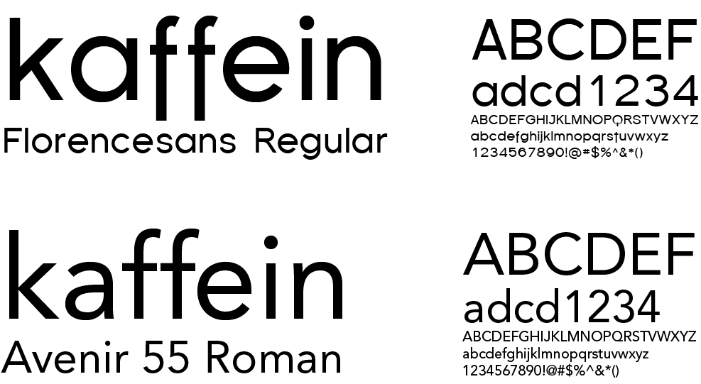
Along with the logo concepts, I had also chosen three fonts that I thought represented the brand well and fit with the logos without being too distracting.
Gotham and Young were two simple sans-serif fonts, and Florencesans was a little more out-there with it's extended "f" glyphs.
I eventually settled on Florecnesans as the primary font because it had quite a bit more character than the other two. I also liked how the extended "f"s evoked an image reminiscent of the "steam lines" from a few of the original logo concepts. Ultimately, I chose Avenir Roman as the companion font. It was similar in shape/style and I thought it complemented Florencesans nicely. (Gotham seemed a bit large/round, and Young was just a little too stylish/distracting for my tastes.)
I put together a color palette from the original colors I got from Amir using Coolors.co, probably one of the most useful tools I've found online. It lets you build color palettes from certain colors and make quick modifications. My favorite difference between Coolors and similar palette builders (Adobe Kuler, etc) is the ability to lock certain colors into your palette and then have Coolors pick additional colors to add to your Palette that look nice together. This is super handy when you have 2-3 colors and you need some inspiration for 1-2 more. Plus the Coolors interface is super simple and intuitive. (Plus all the colors are named, which is just fun when you can pitch color variations like "Aero" and "Azure Mist" to a client instead of "Okay so I have like 3 blues for you to choose from.")
And here's the final logo at the end of the design process. Clean, simple, elegant, professional. Plus very easy to convert to single-color for applicatiions where that's necessary.
The Animation
I wound up pitching 3 different animation concepts to Amir.
The first, which I nicknamed "Gravity," was loosely inspired by the Pixar logo animation. Cartoon-ish easing on the animation of the "ball," breaking the logo apart, and landing quickly. I thought it was a cute take on the logo.
Logo Concept #1 - "Gravity"
The second logo concept - "Velocity" - was a bit of a variation on the "Gravity" concept, but in a slightly less cartoonish way. This is also the only animation of the 3 that contains motion blur - which I felt added to the feeling of speed from the "ball". This concept still used the breaking apart of the original shape, but with a more "atomic" vibe.
Logo Concept #2 - "Velocity"
Option #3 - "Revolve": the version Amir decided to go with. With this one I stepped away from breaking apart the mug and just spun it in. This version definitely drives home the mug imagery, and there's probably some psychological benefit to not having the "shatter" subtext of the first two. I really like how the 2.5D turned out, giving it the look of a 3D mug without any shading or 3D work. The lambda / "K" (I know it doesn't look like a K) were just put into an AE Comp with an extended left light blue edge, masked to the mug's shape, and position animated to the right to match the "ball", which is animation on a curved motion path (with some change in Z space to move it in front of the mug - so I guess it's not ENTIRELY without 3D, but all done within AE).
Logo Concept #3 - "Revolve"
Final Thoughts
Overall, I'm thrilled with how this came out, and Amir and his team were super happy with the final product.
From a design standpoint, I certainly learned a lot of good lessons (some obvious - some less so), which I'll try to summarize here as a TL;DR:
- Don't get super attached to any of your design concepts because those are always the ones that get the ax.
- Abstract logos may impress your design friends on Dribbble, but if people can't immediately tell what it is, it's not a good concept for a logo.
- Choosing fonts is always harder than you think it will be.
I went ahead and mocked up some cool brand/stock images (courtesy of Unsplash) with the Kaffein logo and I'm stoked to see where Amir and the Kaffein team go next! ∎
Validate my existence:
Kaffein ft. Caffeine
I got my hat design.
Swipe right.


